Use these tips and guidelines when selecting or creating original images for use on HeadStart.gov and Office of Head Start products. Images embedded in mock-ups and drafts are generally highly compressed and serve as visual aids only. After submitting an original image, see Page Elements and Page Layouts to prepare modified images for the website.
Image Resolution and Size
High-resolution displays have become the standard for computer screens, smartphones, and tablets. To make sure all images and graphics are clear across devices, every photo must be submitted at a resolution of 2,800 pixels (px) @ 72 pixels per inch (ppi).
Follow the chart below when capturing digital images, so they can be edited natively to meet current industry standards.
Photo Capture Recommendations
Follow the chart below when capturing digital images so they can be edited natively to meet current industry standards.
| Image Sources | Photo Quality |
|---|---|
| Digital Camera | 6-megapixel camera (3,008 X 2000 px) and above |
| Digital Scan (printed photography) | 5x7" – 3,000 x 4,200 px @600 ppi scan 8x10" – 2,400 x 3,000 px @ 300 ppi scan 11x14" – 3,300 x 4,200 px @ 300 ppi scan |
| Stock Photography | 2,800 px @ 72 ppi |
For information about preparing images for social media, see Multimedia Elements.
Selecting Images
Keep in mind the overall look and feel of the page. Images lose their power when they become repetitive. Remember that one image communicates information about a resource, but multiple images convey information about the whole page.
- Select images that are not over-the-top (e.g., an illustration with a neon background may draw attention, but it also breaks with the look and feel of the website as a whole).
- Avoid images that have high contrast or are muted due to too much of the same color. Monotone images can create a lack of interest because all the elements blend in together (e.g., a person in a blue shirt in front of a blue ocean with a blue sky).
- Do not use light flares or unnatural image filters.
- Purchase royalty-free stock photography rather than using watermarked images from the internet.
Scanning Photography
Although it is common to capture images digitally, there are scenarios where physical media, like film negatives or printed photography, require digital scanning. Review digitizing considerations below and then refer to the Photo Resolution table above.
Before scanning, make sure images are:
- In focus and clear
- High or best quality possible, not low resolution
- Clear of scratches, blotches, or water stains
- Not color saturated or too dark to see
- Cropped properly
- Free of copyright names or logos unless they are from the Office of Head Start
- For black and white images, use Grayscale setting for color mode instead of RGB
Remember to keep originals of every image used.
Composite Images
Avoid using composite images whenever possible. Real situations involving real people are more persuasive than those without.
Don't superimpose one image on top of another unless you can make it look very realistic. Choppy edges, different lighting, the lack of natural shadows, and different levels of focus can cause an image to seem badly composed.
Example
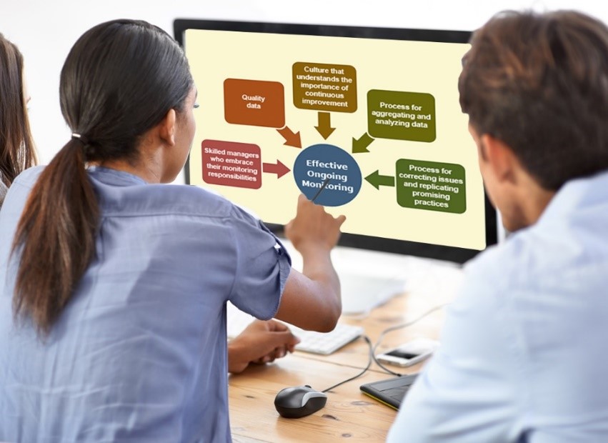 Notable issues:
- The screen’s image is out of focus.
- The hand that is pointing at the monitor is badly cut out and doesn’t have the same blur applied to it that the surrounding skin and screen have.
- The colors are not as strong as they could be; turning up the vibrancy and adjusting the levels would make this a stronger photo (e.g., the blue in her shirt and the wood stain would pop).
- The text within the image makes this image not 508 compliant, although it’s probably not meant to be read. In that case, the flowchart should be a characteristic image for this product that the target audience can relate just by looking to shapes and colors.
- The image doesn’t appear like this on the screen anywhere on our site, so it is not an accurate representation.
Burned-in Text
Do not use images with text overlay, also called burned-in text.
Burned-in text should be avoided in images for the following reasons:
- Lack of continuity across English and Spanish content.
- Does not meet 508 compliance requirements.
- Cannot be read by screen reading software, so excludes those users from the information.
Correct:  | Incorrect:
|

If burned-in text cannot be avoided, such as in logos or social media images, the image must be submitted in English and Spanish and the text against its background must be 508 compliant. If the text is not meant to be read, the image itself should convey the meaning of the content.
Last Updated: January 9, 2025